Mobile-First Design: Why It Matters More Than Ever
The mobile revolution has fundamentally transformed how people access and interact with digital content. What began as a secondary consideration for web designers has become the primary focus, with mobile devices now accounting for over 60% of global web traffic. Yet many organizations still approach mobile design as an afterthought, retrofitting desktop experiences for smaller screens instead of embracing mobile-first principles from the ground up.
This shift isn’t just about accommodating different screen sizes—it represents a complete rethinking of how we design digital experiences. Mobile-first design forces us to prioritize content, streamline interactions, and create faster, more focused user journeys that benefit everyone, regardless of their device choice.
The Unstoppable Rise of Mobile Usage
The statistics surrounding mobile usage paint a clear picture of the digital landscape’s evolution. Mobile devices have become the primary gateway to the internet for billions of users worldwide, with smartphone penetration reaching unprecedented levels across all demographics and geographic regions.
This mobile dominance extends beyond simple browsing. People use their phones to shop, bank, learn, work, and connect with others. The average person checks their phone over 90 times per day, spending more than three hours engaged with mobile content. These behaviors have created entirely new expectations for digital experiences.
Mobile users exhibit different interaction patterns compared to desktop users. They’re often multitasking, dealing with distractions, and operating in varied lighting conditions. They expect immediate access to information and seamless functionality despite potentially unstable internet connections and limited battery life.
Understanding these unique mobile contexts is crucial for creating effective digital experiences. Mobile-first design acknowledges these constraints and opportunities, creating solutions that work brilliantly in real-world mobile scenarios while scaling beautifully to larger screens.
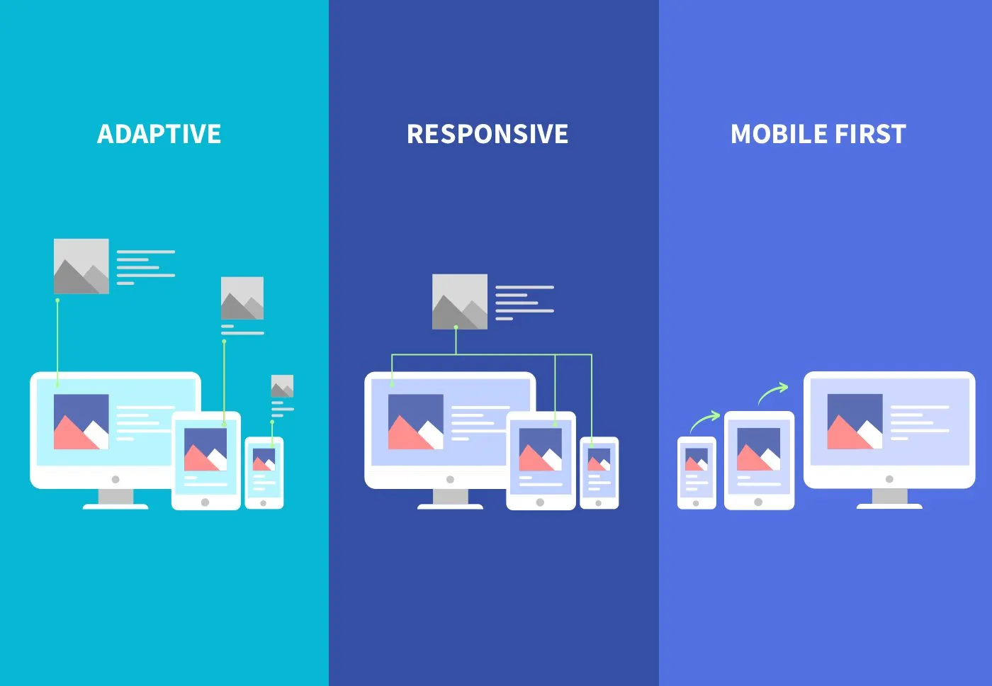
Understanding Mobile-First vs Responsive Design
While responsive design and mobile-first design are often mentioned together, they represent different philosophical approaches to multi-device experiences. Responsive design typically starts with a desktop layout and adapts it for smaller screens, while mobile-first design begins with the mobile experience and progressively enhances it for larger displays.
The mobile-first approach offers several advantages over traditional responsive techniques. By starting with the most constrained environment, designers are forced to prioritize essential content and functionality. This constraint-driven design process often results in cleaner, more focused experiences that benefit users across all devices.
Mobile-first design also aligns better with progressive enhancement principles, where basic functionality works everywhere and enhanced features are layered on for capable devices and connections. This approach creates more robust, accessible experiences that degrade gracefully under adverse conditions.
From a technical perspective, mobile-first CSS is more efficient. Starting with mobile styles and adding desktop enhancements through media queries results in smaller initial payloads and faster loading times. This performance benefit is particularly important for mobile users who may be on slower connections or have data limitations.
The Business Case for Mobile-First
The business implications of mobile-first design extend far beyond user satisfaction metrics. Companies that embrace mobile-first approaches consistently see improvements in conversion rates, customer engagement, and competitive positioning. The correlation between mobile optimization and business success has become increasingly pronounced.
Search engine optimization provides one of the clearest business arguments for mobile-first design. Google’s mobile-first indexing means that the mobile version of your website is considered the primary version for ranking purposes. Sites that provide excellent mobile experiences receive preferential treatment in search results, driving more organic traffic and reducing customer acquisition costs.
E-commerce data reveals the financial impact of mobile optimization. Mobile commerce now represents over half of all online sales, with this percentage growing annually. Companies with well-optimized mobile experiences see significantly higher conversion rates and average order values compared to those with poorly designed mobile sites.
Customer retention and loyalty also improve with better mobile experiences. Users who have positive mobile interactions are more likely to return, recommend the service to others, and engage with additional products or services. This creates compound benefits that extend the lifetime value of each customer relationship.
Core Principles of Mobile-First Design
Effective mobile-first design rests on several fundamental principles that guide decision-making throughout the design process. Content prioritization sits at the heart of this approach, requiring designers to identify and emphasize the most important information and functionality for mobile users.
The principle of progressive disclosure becomes crucial in mobile contexts where screen real estate is limited. Instead of overwhelming users with all available options, mobile-first design reveals information and functionality gradually as users need it. This creates more manageable, less intimidating interfaces that guide users through complex processes step by step.
Touch-first interaction design recognizes that mobile users primarily interact through finger gestures rather than precise mouse clicks. This means designing larger touch targets, considering thumb reach patterns, and creating gesture-friendly interactions that feel natural on touch devices.
Performance optimization is woven into every aspect of mobile-first design. From image compression to code efficiency, mobile-first approaches prioritize fast loading times and smooth interactions. This performance focus benefits all users while being absolutely critical for mobile success.
Navigation Strategies for Small Screens
Traditional desktop navigation patterns often fail on mobile devices, requiring innovative approaches that work within the constraints of smaller screens. The hamburger menu has become ubiquitous, though its effectiveness depends heavily on implementation and context. When used correctly, hidden navigation can reduce clutter while maintaining access to full site functionality.
Tab bars work exceptionally well for mobile applications and websites with clear primary sections. By keeping the most important navigation options visible at all times, tab bars reduce cognitive load and provide clear wayfinding cues. The key is limiting tabs to five or fewer options to prevent overcrowding.
Bottom navigation has gained popularity as designers recognize that thumbs naturally rest at the bottom of mobile screens. Placing primary navigation at the bottom creates more comfortable, one-handed usage patterns while leaving the top of the screen available for content and branding.
Breadcrumb navigation takes on new importance in mobile contexts where users can easily lose their place in deep content hierarchies. Well-designed mobile breadcrumbs provide context and easy paths back to higher-level sections without taking up excessive screen space.
Content Strategy for Mobile Users
Mobile content strategy requires rethinking both what information to present and how to present it effectively. The inverted pyramid journalism model works exceptionally well for mobile content, placing the most important information first and supporting details later. This approach ensures that users get value quickly, even if they don’t read complete articles.
Scannable content becomes even more critical on mobile devices where users often browse quickly in distracting environments. Short paragraphs, descriptive headers, bullet points, and visual breaks help users process information efficiently. The goal is creating content that works for both deep reading and quick scanning.
Visual storytelling takes on heightened importance in mobile contexts. Images, videos, and infographics can communicate complex information more efficiently than text alone. However, visual content must be optimized for mobile viewing, with consideration for data usage and loading times.
Personalization and contextual content delivery help mobile users find relevant information quickly. By understanding user location, device capabilities, and usage patterns, mobile-first designs can surface the most appropriate content for each situation.
Optimizing Forms and Interactions
Form design presents unique challenges in mobile environments, where typing is more difficult and screen space is limited. Mobile-first form design emphasizes simplicity, clarity, and efficiency to reduce user friction and improve completion rates.
Input field optimization involves choosing appropriate input types that trigger relevant mobile keyboards. Using email inputs for email addresses, number inputs for quantities, and date pickers for dates creates smoother, more efficient form-filling experiences. Autofill compatibility further reduces typing requirements.
Single-column layouts work best for mobile forms, creating clear visual flow and reducing cognitive complexity. Progressive disclosure can break long forms into manageable sections, showing only relevant fields based on previous inputs. This approach makes complex forms feel less overwhelming.
Error handling becomes crucial when users might be dealing with unstable connections or difficult typing conditions. Clear, immediate feedback about form validation helps users correct mistakes quickly without losing their progress. Inline validation provides guidance in real-time rather than forcing users to submit before seeing errors.
Performance Considerations for Mobile
Mobile performance optimization goes beyond basic web performance principles to address the unique challenges of mobile networks and devices. Connection variability means designing for intermittent connectivity and slower speeds, while device limitations require careful resource management.
Progressive loading strategies become essential for mobile success. Critical content should load first, with supplementary elements loading progressively as needed. This approach ensures that users can begin consuming content quickly while additional features enhance the experience in the background.
Image optimization takes on special importance in mobile contexts where data usage matters and connection speeds vary. Responsive images, next-generation formats, and aggressive compression help balance visual quality with performance requirements. Lazy loading prevents unnecessary data usage for images that users never see.
Caching strategies must account for mobile users who may access content in various locations and connectivity conditions. Intelligent caching can provide offline functionality for critical content while ensuring that dynamic information remains current when connections are available.
Accessibility in Mobile-First Design
Mobile accessibility considerations often overlap with general usability principles, creating experiences that work better for everyone. Touch target sizing becomes crucial for users with motor impairments, while high contrast design helps in bright outdoor lighting conditions that affect all mobile users.
Voice interaction and screen reader compatibility take on heightened importance in mobile contexts where visual attention may be divided. Properly structured content with semantic markup ensures that assistive technologies can provide effective navigation and content consumption experiences.
Gesture-based interactions must include alternative input methods for users who cannot perform complex touch gestures. Simple taps and standard interface elements should provide access to all functionality, with advanced gestures serving as shortcuts rather than exclusive interaction methods.
Cognitive accessibility considerations become more pronounced in mobile environments filled with distractions. Clear visual hierarchy, consistent interaction patterns, and predictable navigation help all users accomplish their goals more effectively.
Testing and Iterating Mobile Experiences
Effective mobile-first design relies heavily on real-world testing with actual mobile devices and users. Emulators and responsive design tools provide valuable development feedback, but they cannot replicate the true mobile experience with all its contextual challenges and opportunities.
Device testing should encompass a range of screen sizes, processing capabilities, and network conditions. Understanding how your design performs on older devices with slower processors helps ensure broad accessibility. Testing on various network speeds reveals performance bottlenecks that might not be apparent on high-speed connections.
User testing with mobile devices often reveals insights that desktop testing misses. Observing how users hold their devices, navigate with their thumbs, and interact while multitasking provides valuable feedback for interface refinements. Context-aware testing in real environments adds another layer of insight.
Analytics and user feedback provide ongoing insights into mobile performance and user satisfaction. Monitoring mobile-specific metrics like touch interactions, scroll patterns, and conversion funnels helps identify areas for improvement and validate design decisions.
The Future of Mobile-First Design
As mobile technology continues evolving, mobile-first design principles are expanding to encompass new interaction paradigms and device capabilities. Foldable screens, voice interfaces, and augmented reality features require designers to think beyond traditional mobile constraints while maintaining focus on user needs and contexts.
Progressive Web App technologies are blurring the lines between web and native experiences, enabling mobile-first designs that feel app-like while maintaining web accessibility and discoverability. These hybrid approaches combine the best aspects of both platforms.
Artificial intelligence and machine learning are enabling more personalized and predictive mobile experiences. Mobile-first designs increasingly adapt to individual user patterns, preferences, and contexts, creating truly tailored digital experiences that improve over time.
The Internet of Things is expanding mobile-first thinking beyond phones and tablets to encompass smartwatches, automotive displays, and other connected devices. The principles of constraint-driven design, content prioritization, and context awareness remain relevant across this expanding ecosystem.
Mobile-first design has evolved from a technical approach to a fundamental philosophy about creating digital experiences that work for real people in real situations. By starting with mobile constraints and building up, designers create solutions that are faster, more focused, and more accessible for everyone.
The businesses and organizations that embrace mobile-first thinking position themselves for success in an increasingly mobile world. This isn’t just about accommodating smaller screens—it’s about understanding how people actually use digital products and creating experiences that fit seamlessly into their lives.
As we look toward the future, mobile-first design principles will continue guiding the creation of digital experiences that are not just mobile-friendly, but truly mobile-native. The organizations that master these principles today will be best positioned for tomorrow’s digital landscape, whatever new devices and interaction methods it may bring.